Metal cards are one of those objects people think they understand… until they hold a good one. Then it clicks: weight isn’t just weight. Finish isn’t just “shiny.” And the difference between “premium” and “expensive” suddenly gets very measurable.
I’ve worked with enough prototypes to tell you this: a metal card is basically industrial design hiding inside a rectangle. Do it right and it becomes a tiny, daily ritual. Do it wrong and you’ve made a heavy, scratchy regret that looks great in a render.
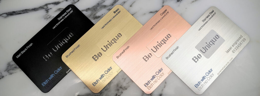
Metal card examples that prove the medium is bigger than the card
A metal card can be severe or playful, cold or warm, brutally minimal or decorative in a way that still feels disciplined. The material decides more than most people expect.
Titanium tends to feel like engineered restraint. Stainless steel is confidence with a mirror in its pocket. Aluminum is the sneaky one: it’s light, fast to iterate, and way more expressive once you stop treating it like the “budget metal.”
One line of truth:
You’re not selling metal. You’re selling the feeling of permanence.
Premium isn’t a finish. It’s a system.
If you only change the material, you might get a nicer object. Premium comes when everything is tuned to match: substrate, coating, edge geometry, typography, and, boring but critical, quality control.
Here’s the framework I use when someone asks “what makes it premium?” For visual reference, reviewing real metal card examples can make the differences in finish, engraving, and edge treatment much easier to evaluate.
– Tactility: grip, temperature, edge comfort, and the way the card exits a wallet
– Durability stack: base metal + coating + how the mark is applied (print vs engrave vs inlay)
– Legibility over time: will the type still read after 6 months of pockets and keys?
– Sound and flex: yes, really. A stainless card “clicks” differently than aluminum
– Manufacturing discipline: tolerances, repeatability, defect rate, and finish consistency across batches
Now, this won’t apply to everyone, but if your brand is “quiet luxury,” don’t pick a finish that screams fingerprint magnet. People don’t experience premium in a lab. They experience it at a bar, at reception, or half-asleep in an airport.
Titanium vs stainless vs aluminum (the real differences, not brochure talk)
Titanium
Titanium gets romanticized, but it earns the reputation. Strong, corrosion-resistant, relatively light for its strength. It feels “technical” in the hand, like it belongs in aerospace because… it does.
Downside: machining can be slower and fussier, and cosmetic consistency takes effort. Also, titanium can look a little flat if you don’t pair it with the right finish or contrast.
Stainless steel
Stainless is the standard for a reason. It’s dense, it polishes beautifully, and it tolerates abuse. If you want a card that feels like it could survive a decade of bad decisions, stainless is your friend.
It can also feel clinical. That’s not always a negative. In finance and security contexts, “clinical” reads as trustworthy.
Aluminum
Aluminum is the chameleon. Lightweight, excellent for anodizing, fast to prototype, and (in many cases) easier on cost. People dismiss it as less premium, but that’s mostly because they’ve only seen cheap executions.
If you lean into texture, color, and smart edge treatment, aluminum can look intentionally modern rather than “lightweight.”
A concrete sustainability angle, since it comes up fast: aluminum recycling is extremely energy-efficient compared to primary production, recycled aluminum can save ~95% of the energy versus producing new aluminum from bauxite (International Aluminium Institute, frequently cited statistic). That doesn’t make every aluminum card ethical by default, but it changes the conversation.
Finishes: brush, mirror, satin (choose a personality)
Brush finish is the workhorse. It hides wear, it reads premium without shouting, and it plays nicely with etched or laser-marked graphics.
Mirror is a flex. It also shows everything: fingerprints, micro-scratches, bad handling, sloppy packaging. If you don’t have the process control to keep it perfect, don’t do it. I’ve seen mirror cards go from “wow” to “why” in a week.
Satin is the diplomat. Softer reflection, better comfort, less visual noise. If your card will be handled constantly, satin is often the grown-up choice.
Look, the finish isn’t just aesthetics; it’s maintenance disguised as branding.
Personalization that doesn’t look like an afterthought
You’ve got three main lanes: etching, engraving, and inlay. They’re not interchangeable, even if they can look similar in photos.
Etching
Chemical or laser etching can produce fine lines and intricate patterns. Great for “circuit-like” detail, gradients, and delicate brand motifs. Depth is typically shallow, so you’re relying on contrast and finish to make it read.
Engraving
Engraving is commitment. It cuts into the metal, adds tactile depth, and tends to age well. If you want the card to feel like a tool or an heirloom object, engraving gets you there faster.
Inlay
Inlay is where things start to look expensive in a way people can’t quite explain. Contrast materials (enamel, resin, carbon fiber accents, even precious metal touches) create a layered effect: weight + color + depth. It’s also more complex to assemble and QA, so you pay for that elegance.
Opinion, from too many production meetings: inlay is the easiest way to make a card look premium, and the hardest way to keep yields high.
Durable finishes that actually earn the word “durable”
PVD coating
PVD (physical vapor deposition) gives you hard, thin coatings with rich color: black, gunmetal, gold tones, iridescent effects if you’re bold. It’s commonly used on watches for a reason. Done well, it resists wear far better than basic plating.
Done poorly, it chips at edges. And edge chipping is the kind of defect customers remember.
Anodizing
Anodizing is mostly an aluminum play. It’s not paint; it’s an electrochemical process that thickens the oxide layer, and that layer can be dyed. The best anodizing looks like the color is inside the metal rather than sitting on top.
It can still scratch, though, and deep scratches reveal base metal. So you design around that reality, texture helps.
Hard coatings / clear coats
Hard coats can protect graphics and reduce micro-scratching. They can also mute the “metal-ness” if you overdo thickness or gloss. That trade-off is real, and it’s usually decided by the first prototype people handle.
One-line warning:
If your durability story depends on a coating, your edge design matters as much as your coating.
Form and feel: weight, balance, longevity (the stuff you can’t fake)
The human hand is a brutally honest sensor. It notices imbalance. It notices sharp corners. It notices when the card catches fabric on the way in and out.
A few design levers that punch above their weight:
– Edge chamfer or radius: tiny changes here can turn “premium” into “pocket-friendly”
– Thickness: too thin feels cheap; too thick feels gimmicky (and can jam wallets)
– Center of gravity: especially with cutouts or multi-material builds
– Texture placement: grip where fingers naturally land, not where it looks cool in CAD
Also: metal allergy is a real constraint. Some people react to nickel in certain alloys and finishes. If you’re building at scale, you plan for this early instead of discovering it through angry customer support tickets.
Branding on metal: typography, layout, and die-cuts (aka don’t ruin it with bad type)
Typography on metal isn’t graphic design; it’s industrial marking. Depth, stroke width, and reflectivity all change legibility.
I tend to push clients toward:
– High-contrast sans for laser marks and shallow etches
– Moderate weight (hairlines disappear under glare)
– Spacing that breathes because metal reflection visually “fills in” tight counters
Die-cut shapes are fun. They’re also a manufacturing and durability decision. Cutouts can weaken the card, snag in wallets, and create coating stress at corners. If you do it, do it with intent: make the geometry part of the brand language, not a novelty window.
When metal cards make sense (and when they’re just expensive noise)
Corporate gifting: strong fit, because the card becomes a durable reminder. Pair it with a thoughtful message and packaging that doesn’t scream landfill.
VIP membership: metal is practically a cheat code. The moment of handoff is the product. Don’t waste it with generic artwork.
Payment cards: different rules. You need durability, compliance, and consistent machinability. The premium moment repeats daily, which means wear patterns matter more than unboxing drama.
Here’s the thing: metal cards work best when the experience is repeated. If the card is seen once and forgotten, you’ve bought a trophy, not a tool.
Production realities (where dreams meet tolerances)
Milling tolerances in real life
Milling is where “close enough” becomes visible. Tool wear, feed rate, and material hardness all change edge fidelity and surface quality. And tiny deviations compound: a slight misalignment plus coating thickness plus assembly tolerance can turn into a card that feels off even if it passes inspection.
I’ve seen brands chase exotic shapes when they really needed:
– better deburring
– more consistent chamfering
– tighter QC on flatness
Sexy problems are rarely the real problems.
Printing methods and finishes: turning a card into a tactile conversation
Printing on metal can be gorgeous or tragic. You’re balancing adhesion, abrasion resistance, and contrast against a surface that reflects light like it’s trying to sabotage your design.
Common approaches:
– UV printing: flexible for color and gradients; can wear if unprotected
– Screen printing: strong, consistent, good for bold marks; limited in fine detail
– Laser marking: durable, crisp; limited to tonal contrast unless combined with fills
– Enamel fills over engraving: high-end look, tactile depth, slower production
Pairing print with a protective clear coat can help, but it can also flatten the tactile feel. That’s the push-pull: protection versus “raw metal honesty.”
A practical way to choose (because theory is cheap)
Prototype small variations. Two finishes. Two edge treatments. One typography change. Then handle them like a normal person for a week: pocket, wallet, desk, keys nearby (unfortunately realistic). The best choice usually stops being a debate and starts feeling obvious.
Premium is rarely the loudest option.
It’s the one that survives contact with real life and still feels intentional.
